CSS-only responsive sliderの使い方
- 下記ページの 「DOWNLOAD」 よりファイル1式をダウンロード。
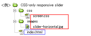
- ダウンロードしたファイルを任意の場所にコピー。
- 動作させるファイル(サンプルではindex.html)にコードを記述。
<パスは上記ファイル構成の場合なので環境にあわせて変更>
・head部分にcssファイルを読み込ませるためのコードを記述。<head> <!--ダウンロードしたファイル--> <link rel="stylesheet" type="text/css" href="css/screen.css" /> </head>
サンプルのcssコード(サンプルのcssは改変しています)
/*ページ設定部分(style.cssなどで設定していれば削除する)*/ body, ul, li, h1, h2, span { margin: 0; padding: 0; } body { font: 75% Verdana, Arial; color: #333; background: #fff } #container { width: 90%; min-width: 300px; max-width: 1200px; margin: 50px auto; } /*ここまでページ設定部分*/ /*ここからSexy Tooltipsの設定*/ /*----------------------header-------------------------------*/ header { text-align: center; position: relative; background-image: url(../images/slider-horizontal.jpg); background-repeat: repeat-x; background-position: 0 bottom; background-size: 400%; padding-bottom: 32.5%; -webkit-animation: h_slide 24s ease-out infinite; -moz-animation: h_slide 24s ease-out infinite; animation: h_slide 24s ease-out infinite; } @-webkit-keyframes h_slide { 0% { background-position: 0% bottom; } 20% { background-position: 0% bottom; } 25% { background-position: 33.33333% bottom; } 45% { background-position: 33.33333% bottom; } 50% { background-position: 66.66667% bottom; } 70% { background-position: 66.66667% bottom; } 75% { background-position: 100% bottom; } 95% { background-position: 100% bottom; } 100% { background-position: 133.33% bottom; } } @-moz-keyframes h_slide { 0% { background-position: 0% bottom; } 20% { background-position: 0% bottom; } 25% { background-position: 33.33333% bottom; } 45% { background-position: 33.33333% bottom; } 50% { background-position: 66.66667% bottom; } 70% { background-position: 66.66667% bottom; } 75% { background-position: 100% bottom; } 95% { background-position: 100% bottom; } 100% { background-position: 133.33% bottom; } } @keyframes h_slide { 0% { background-position: 0% bottom; } 20% { background-position: 0% bottom; } 25% { background-position: 33.33333% bottom; } 45% { background-position: 33.33333% bottom; } 50% { background-position: 66.66667% bottom; } 70% { background-position: 66.66667% bottom; } 75% { background-position: 100% bottom; } 95% { background-position: 100% bottom; } 100% { background-position: 133.33% bottom; } }サンプルのhtmlコード
<!DOCTYPE html>
<html lang="ja">
<head>
<meta charset="utf-8" />
<title>CSS-only responsive slider</title>
<link rel="stylesheet" type="text/css" href="css/screen.css" />
</head>

<body>
<div id="container">
  <header> </header>
</div>

</body>
</html>
- ファイル1式をサーバーにアップロードして設置完了。